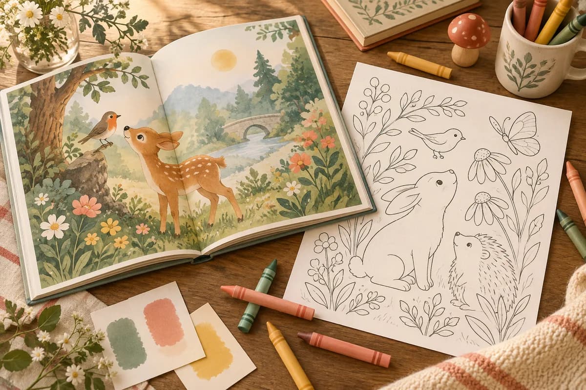
A cozy coloring book promises a particular kind of experience: an inviting scene, enough open space to color comfortably, and visual continuity from page to page. A collection of unrelated AI images may share a prompt word such as “cozy” while still failing as a book. One page has tiny fussy details, another has gray shading that cannot be colored, a third repeats the same cottage, and the cover advertises a style the interior never delivers. The work is in planning the reader, directing a consistent visual language, editing each generated image, and testing the actual printed or printable file.
This guide develops an invented “quiet rooms and rainy afternoons” book from concept to proof copy. It covers page architecture, prompt design, line-art inspection, print geometry, accessibility, image rights, AI disclosure, and a genuine product test. The example is a creative exercise, not evidence that any theme sells. EarnDraft can help organize a book plan and accompanying text at /create. Create, edit, and verify the actual coloring artwork with appropriate illustration tools and human review; do not assume a text-drafting tool supplies a dedicated coloring-book workflow.
Decide what “cozy” means for this reader
Cozy is an emotional direction, not a complete production brief. A child with thick crayons needs broad enclosed areas, recognizable shapes, and minimal crowding. An adult who enjoys intricate interiors may want furniture, fabrics, and small objects to explore. An adult with limited grip strength or who wants a calm, quick session might prefer bold, easy shapes even though the book is marketed to adults. The tool should not decide line density from age alone. Describe the hand that will color the page and the experience it should have.
| Reader and use | Art direction | Page risk | Test material |
|---|---|---|---|
| Young child with crayons | Large forms, thick outlines, few objects | Tiny spaces and confusing overlaps | Actual crayon and child-size print |
| Older child with pencils | Clear scene plus optional details | Repeated subjects | Pencil proof and page-sequence review |
| Adult bold and easy | Calm compositions, broad areas | Too much empty sameness | Marker and pencil comparison |
| Adult detailed | Layered interiors, textures, distinct zones | Gray shading and microscopic spaces | Full-size print and close inspection |
| Group activity | Simple prompts, varied scenes | Repetitive motifs | Several readers coloring different pages |
Write a reader promise in one sentence. For example: “Thirty distinct indoor and garden scenes with bold closed outlines, one main subject per page, and enough open area for markers or pencils.” Do not add “stress relief,” “therapy,” or health claims without evidence and appropriate context. You can say the book is designed for a calm coloring session; you cannot guarantee a clinical effect. If the book is printable, state actual page size and what files are included. If it is a paperback, test the paper and gutter before promising marker suitability.
The market may already contain many books using the same motifs. Search actual store results and read critical reviews as qualitative clues: repeated images, thin paper, muddy linework, too much detail, or incorrect trim. Reviews do not reveal reliable sales totals, and a high rank does not prove a niche is open. Your differentiator should be visible in the sample pages: stronger art direction, better print usability, a coherent story-world, or a particular age and tool fit. For channel economics and listing choices, see how to sell coloring books.
Create a visual bible before generating pages
A visual bible is a small set of fixed design rules. It allows the book to vary its scenes without changing its identity. Record line weight, shape complexity, composition, motif vocabulary, character design if any, margins, paper assumptions, and things to avoid. Keep a few approved reference pages to compare later generations. If the image model supports reference images, check its terms and use only references you own or may legally use. Do not imitate a living artist’s recognizable work or another book’s protected characters.
| Design rule | Invented “quiet rooms” example | Reason |
|---|---|---|
| Main form | One clear room or garden vignette | Instant readability |
| Outline | Strong, clean, closed black line | Areas can be colored |
| Detail | A few patterned objects, not full-page texture | Calm rather than clutter |
| Background | Mostly white; no gray wash | Leaves space for color |
| Character | Recurring small cat with fixed features | Continuity across scenes |
| Borders | Thin, consistent frame with safe margin | Avoids trim clipping |
| Text | Optional caption outside artwork | Prevents image-model gibberish |
| Exclusions | Logos, exact brands, legible signage, extra limbs | Protects quality and rights |
Define the recurring character in observable terms, not just “the same cat.” Specify ear shape, tail curl, collar or no collar, approximate size relative to furniture, and how much expression may vary. Create a clean character sheet under your own direction if the production system supports it. Still check each page: reference-conditioned generation can drift. A character appearing with three different tails or an inconsistent face weakens a book’s continuity and can frustrate a reader who grows attached to it.
For a character-free book, the continuity can come from architecture, recurring objects, border treatment, or a sequence of seasons. A teapot appears in a kitchen, then a picnic, then beside a reading chair. Repetition can be charming when the context changes, but literal duplicates are not variety. Plan how motifs migrate across pages. The visual bible should be a guide to composition, not a command to clone the same scene thirty times.
Plan the page sequence for variety
List all pages before generating final art. Give each page a unique focal subject, setting, viewpoint, and detail rhythm. Alternate wide and close compositions, interiors and exteriors, still life and gentle character action. Keep the style consistent while changing the activity. A book of thirty cottages viewed from the same angle will feel thin even if each cottage has a different window. A sequence can create an implied day or season without needing a written story.
| Page | Focal idea | Viewpoint | Recurring motif | Distinctive coloring areas |
|---|---|---|---|---|
| 1 | Window seat on a rainy morning | Interior wide | Curled cat | Cushion, panes, plants |
| 2 | Teapot and cups | Table close-up | Star-shaped spoon | Ceramic, cloth, steam shapes |
| 3 | Small bookshop entrance | Street front | Cat in window | Door, awning, books |
| 4 | Garden shed in autumn | Exterior wide | Teapot on shelf | Leaves, wood, pots |
| 5 | Knitting basket | Floor-level close-up | Curled yarn tail | Yarn, blanket, basket |
| 6 | Evening desk | Overhead | Star-shaped spoon | Notebook, lamp, mug |
This is a fictional plan. It demonstrates the matrix, not a required motif list. Make a full lineup with enough distinct subjects for the promised page count. Group pages into sections such as “morning,” “small errands,” “home again,” and “evening,” then check whether the visual density rises and falls pleasantly. Some pages can be open and quick; others can reward a longer session. Tell buyers honestly which style the book contains rather than calling a highly detailed book “bold and easy.”
Add a novelty check to the lineup. Compare any page with its nearest neighbor and with the whole set. Does it have a different focal object, silhouette, viewpoint, and coloring task? If two pages differ only by a plant on the windowsill, redesign one. A contact sheet of thumbnails is useful here. At thumbnail scale, a reader can see sameness more readily than when opening each page separately. Ask a reviewer to identify pages they would skip because they seem redundant.
Write prompts that describe a colorable page
An image prompt should communicate subject, composition, line-art requirements, and exclusions. Avoid relying on a long chain of style adjectives. “Cozy, whimsical, magical, beautiful, cute” can produce decorative clutter without usable closed shapes. Describe the scene as a line drawing to be colored, with an intentional hierarchy. Prompts are an instruction to an image model, not a guarantee; inspect the result at full size.
Coloring-book page, square composition. One large window seat with a folded blanket, a potted plant, and a small curled cat. Strong clean black outlines, enclosed colorable regions, generous white space, varied but controlled detail, no grayscale shading, no filled black areas, no lettering, no logos, no border crossing the safe margin. Keep the cat’s established ear and tail design. Perspective should be simple enough to read at print size.
If the model supports negative prompts, the exclusions can go there; otherwise keep them in the main brief. A second prompt can vary the viewpoint or focal object without changing the visual bible. Save the prompt, seed or generation settings when available, tool version, and output ID. This production log helps reproduce or repair an image. It also helps identify whether a style change came from your prompt or a tool update.
Use a revision ladder rather than random regeneration. First decide whether the composition is sound. If not, change the scene plan. Next fix structural errors such as an extra paw, impossible furniture, or a broken object. Then clean line issues: open loops, stray marks, duplicate contours, gray textures, or lines too close for the reader’s tools. Finally adjust visual balance. A page that fails at the composition level is not rescued by sharpening the lines. A page with good composition but one defective hand might be retouched by a human illustrator.
Make a page acceptance checklist
Review art at three scales: thumbnail, full-page print size, and close detail. Thumbnail review checks variety and focal clarity. Full-page review tests the actual coloring experience. Close review finds defects and accidental visual artifacts. Do this with the final export, not only a high-resolution source image. Compression and resizing can change line quality.
| Check | Question | Failure response |
|---|---|---|
| Focal clarity | Can I name the main subject at a glance? | Simplify or recompose |
| Closed regions | Can a colorist see where a shape ends? | Retouch or regenerate |
| Line strength | Does the line survive print at trim size? | Adjust stroke and export |
| White space | Are there areas to rest the eye and color broadly? | Remove clutter |
| Anatomy and objects | Are limbs, handles, shelves, and windows coherent? | Draw correction or reject |
| Repetition | Is the page materially different from the rest? | Change viewpoint or subject |
| Text artifacts | Are there accidental letters or symbols? | Remove and reproof |
| Rights | Are logos or recognizable protected characters present? | Replace the element |
| Margin | Will trim or gutter swallow artwork? | Move content inward |
Do not rely on a quick automated image score. An image can be aesthetically pleasing and still be poor to color. Try coloring at least one representative page from each complexity level with the media named in the product description. Markers may bleed through paper; pencils may reveal whether tiny regions are tiring. If the paperback uses single-sided designs, a blank reverse can protect the following design from some bleed-through, but it does not change the paper itself. Tell the buyer to use a protective sheet where appropriate and avoid a claim that a proof has not supported.
Invite a small number of target readers to color test pages. Give them the pages without explaining the intended image. Watch where they pause, whether they can distinguish objects, and whether the line density matches the promise. Ask which page they would choose first and which they would skip. A target reader’s actual behavior reveals more than a general “looks cute” reaction. Keep your own observation separate from their words; do not turn one tester into a claim about the market.
Build print pages around real dimensions
Decide trim size and page count before cover art. A square book and a portrait book change composition, margins, and cover geometry. KDP provides current print trim and bleed requirements and cover specifications; check the live templates for the exact paper, ink, size, and page count you choose. Do not copy a spine width from a different book. An apparently small page-count change can alter the cover template and shift the barcode area.
| Production choice | Consequence | Proof question |
|---|---|---|
| Trim size | Determines composition and buyer handling | Do designs fill the page well? |
| Bleed or no bleed | Changes safe area and export size | Are important lines away from trim? |
| Single-sided pages | Adds blank backs and page count | Does the book open as intended? |
| Paper and ink | Changes line and media behavior | What happens with pencils and markers? |
| Binding gutter | Hides inner edge area | Can every shape be reached? |
| Cover finish | Changes color and contrast | Is the title readable at thumbnail? |
If every design starts on a right-hand page with a blank reverse, plan the sequence and page numbers explicitly. Add title, copyright, introduction, and perhaps a color-test page before calculating the final count. Do not let software insert blanks accidentally. Keep lines and essential detail clear of the gutter and trim. If you use bleed, extend background artwork as required, while preserving safe space for important content. If you do not use bleed, avoid decorative borders so close to the edge that small trim variation makes them look crooked.
KDP’s guidance recommends image resolution appropriate for print, commonly at least 300 DPI for interior images. Resolution alone is insufficient: a low-quality generated image upscaled to 300 DPI remains low-quality. Inspect the raster line itself at full size and in a physical proof. Thin gray or antialiased lines may reproduce weakly. Black line art should look clean in the actual black-and-white interior setting if that is what you choose. Use the platform’s previewer, then order a proof copy. Screen previews cannot show paper show-through, binding reach, or how coloring media behaves.
An ISBN, barcode, and cover are separate production decisions. KDP’s current setup guidance determines whether an ISBN is needed and which options apply to your format. KDP’s low-content classification has specific rules; do not assume a coloring book is a blank journal. Check the official low-content guidance and the actual book type. Leave room for the barcode according to the current cover template. Avoid spine text when the spine is too narrow for readable, compliant type.
Make a printable edition intentionally
A printable PDF is not automatically the same file as a paperback interior. Home printers have different margins and may scale pages without warning. Offer a clearly labeled paper size, and test a normal print setting on an ordinary printer. If buyers in multiple markets are expected, consider separate US Letter and A4 files only if you actually build and inspect both. Do not simply change the page label while stretching the art. Tell buyers whether the download is digital, whether it includes single pages or spreads, and whether they may print for personal use under your license.
Etsy’s digital listing help explains its file delivery limits and formats; check the current limits at upload. A large coloring PDF may need thoughtful compression, but compression should not blur the lines. Name files so a buyer can choose the correct paper size. Include a short read-me with printing instructions, page size, orientation, scale setting, and your contact path for a defective file. Do not hide important instructions in a listing image that disappears after purchase.
| Deliverable | Example filename | Buyer purpose | QA action |
|---|---|---|---|
| Letter PDF | quiet-rooms-letter-v1.pdf |
Home printing in US size | Print at 100% and inspect margins |
| A4 PDF | quiet-rooms-a4-v1.pdf |
Home printing in A4 size | Print at 100% and inspect margins |
| Preview PDF | quiet-rooms-sample.pdf |
See real page quality | Confirm it matches paid files |
| Instructions | read-me-printing.pdf |
Understand files and license | Follow without author assistance |
Test the actual store-delivered package. A source export on your computer is not proof that the buyer receives the right version. Download through a test path when available, open every file, and verify that no draft artwork, duplicated page, or misordered blank sheet slipped in. A coloring book’s page sequence is visible to a buyer in minutes; production care is part of its value.
Design a cover that tells the truth about the interior
The cover should show the art style and audience at thumbnail size. An ornate full-color illustration can attract attention, but if the interior is sparse line art, the buyer may feel misled. Show a colored treatment of an actual interior design or an original scene in the same visual language. Use a subtitle that states the page type or audience: “bold and easy interiors,” “detailed rainy-day scenes,” or a similarly accurate description. Avoid unverified superlatives and income promises.
Check the cover at three sizes: store thumbnail, full product page, and physical proof. The title needs enough contrast and margin; the central scene should not become visual noise at a tiny size. Leave the barcode area clear on print covers. Use a consistent color palette that conveys warmth without becoming a generic beige-and-orange collage. A restrained cover can make the black-line interior feel like an invitation to add the reader’s own color.
For a product listing, include images of uncolored interior pages at actual or representative scale, plus a colored sample if it helps demonstrate possibilities. Label the colored sample so a buyer does not think the interior comes precolored. A short page-flip can show variety and single-sided layout. Show enough to demonstrate quality while choosing a sensible preview subset. The buyer should be able to judge line density, page count, format, and subject variety before purchase.
Rights, AI disclosure, and truthful provenance
KDP’s content guidelines require disclosure of AI-generated text, images, or translations in the publishing flow; the author remains responsible for the work. A generated interior drawing or cover falls within that question even if edited later. Etsy’s Creativity Standards allow seller-prompted AI creations within its framework and require AI use to be disclosed in the listing description. Check the current platform language when publishing; rules can change. A disclosure should be plain, not buried in a dense disclaimer.
Check the image tool’s commercial terms and any reference-image license. Remove logos, protected characters, and art that resembles someone else’s recognizable book. A generated image can still create rights or consumer-confusion problems. The U.S. Copyright Office’s AI resources explain that human authorship matters to U.S. copyright analysis. Record your creative selection, arrangement, manual drawing, editing, captions, and cover design; do not assume a prompt alone gives exclusive protection over every output element.
If the product is a printable, write a short buyer license in ordinary language: what the buyer may print for personal use, whether classroom use is included, and whether resale or redistribution is prohibited. Make only rights claims you can support. If you use commissioned human art, get the commercial-use terms in writing, including whether print and digital resale are covered. If you include a quote or poem under a page, verify permission or public-domain status rather than treating short text as automatically free to reuse.
Create a review board for consistency
Put all approved pages into a contact sheet with their page numbers. A contact sheet exposes style drift, repeated compositions, and sudden density changes. Sort the thumbnails by planned sequence and ask three questions: does the book feel like one world, do adjacent pages offer different coloring choices, and does the ending feel intentional? Then inspect the full-size proofs for errors a contact sheet hides. A production board can track generation, cleanup, rights, proof, and final approval.
| Page status | Meaning | Exit condition |
|---|---|---|
| Planned | Unique concept in lineup | Focal point and role defined |
| Generated | Candidate image exists | Composition worth keeping |
| Cleaned | Structural and line errors corrected | Closed regions and coherent objects |
| Proofed | Full-size export checked | Lines print clearly, margin works |
| Approved | Fits the book and rights log | Ready for final sequence |
Do not confuse “generated” with “approved.” A large batch may save time, but it also creates a temptation to include mediocre pages to hit a number. It is better to reduce the advertised count or make additional distinct scenes than to pad the book with close duplicates. The cover and listing should be updated to reflect the final count. Each rejected page is information about the visual bible or prompt: if many pages fail for clutter, simplify the direction; if they fail for inconsistency, strengthen reference and manual edit rules.
A worked art-direction pass
Imagine the first output for the rainy window-seat page. It has attractive plants and a cat, but the window panes are shaded gray, two mug handles overlap impossibly, and a tiny patterned rug fills the lower third. The composition passes the thumbnail test: the window and seat are clear. The page fails the colorability test. The right repair is not to generate an entirely different cozy room immediately. First remove gray shading, simplify the rug to broad shapes, repair the mugs, and check that each cushion boundary closes.
The next output fixes the shading but changes the cat’s ears and adds an unreadable sign outside. Use the approved character sheet to restore the cat and remove the sign. Print the page at final size. If the plant leaves become needle-thin in the proof, thicken or simplify them. Ask a test reader to color the window, blanket, and plant with the expected tools. If they repeatedly cross boundaries because the contours are ambiguous, edit the lines again. Once accepted, save the final source and export version in the page log.
Repeat this reasoning for a detailed page. The detailed book may intentionally have many small regions, but each should be deliberate and achievable with the advertised medium. If the target reader uses fine pencils, test with fine pencils. If you advertise “bold and easy,” the dense page does not belong even if it is beautiful. Art direction means saying no to technically impressive outputs that violate the book’s promise.
Production economics without a sales fantasy
Before finalizing page count, calculate unit economics for the intended format. A longer paperback raises print cost and changes spine geometry; a printable PDF may have low marginal delivery cost but still requires design, platform fees, customer support, and updates. Use the official KDP paperback royalty information, current print cost calculator, Etsy fees, and any direct-store pricing page. Do not copy another creator’s earnings claim into a forecast for your book.
| Cost or value | Paperback | Printable PDF |
|---|---|---|
| Fixed creation | Planning, art, editing, proofing | Planning, art, editing, file testing |
| Per-sale platform | Royalty formula and print cost | Transaction and payment fees |
| Customer experience | Paper, binding, shipping | Printer and paper controlled by buyer |
| Update path | New files and edition; old copies persist | Replace download and communicate change |
| Buyer preview | Cover and sample pages | Listing images and sample PDF |
Consider two prices as scenarios, not predictions. Calculate contribution per sale using the current platform formula and actual page count. Then ask how many sales would cover production and expected support time, while acknowledging that sales volume is unknown. A lower price can help a buyer try the book, but if it leaves almost no contribution after print cost it may not support a careful product. A higher price must be justified by visible quality and audience fit. Pricing should follow the proof copy, not precede the discovery of what the book truly costs to make.
A complete thirty-page scene map
The six-page sample proves a style, but it does not prove a full book has enough variety. Before making the remaining art, map every page to a distinct task. The example below is a fictional creative plan. It intentionally changes focal scale, setting, weather, and object families while keeping the same quiet-room visual bible. A real author should replace ideas that feel too close to existing work and should revise any page the image tool cannot execute cleanly.
| Page | Scene | Focal task for the colorist | Contrast with nearby pages |
|---|---|---|---|
| 1 | Rainy window seat | Large blanket and panes | Broad opening image |
| 2 | Teapot on a small table | Ceramic pattern choice | Close still life |
| 3 | Bookshop doorway | Awning and stacked books | First exterior |
| 4 | Garden shed | Leaves, tools, and pots | Organic textures |
| 5 | Knitting basket | Yarn and blanket | Floor-level close-up |
| 6 | Evening desk | Lamp, paper, mug | Overhead composition |
| 7 | Porch with boots | Wood, laces, raincoat | Tall vertical forms |
| 8 | Kitchen baking shelf | Jars and pastry shapes | Repeated simple containers |
| 9 | Cat beside a radiator | Fur, cushion, curved heat lines | Character page with open space |
| 10 | Greenhouse bench | Leaves and glass frames | Detailed botanical section |
| 11 | Folded picnic cloth | Large fabric shapes | Visual rest after plants |
| 12 | Tiny street cafe exterior | Chairs and window boxes | Outdoor architecture |
| 13 | Board game table | Geometric pieces | Overhead, playful pattern |
| 14 | Bedroom nightstand | Book, lamp, slippers | Quiet close-up |
| 15 | Raincoat on a hook | Cloth and wall panel | Sparse midpoint break |
| 16 | Flower-arranging corner | Vases and broad petals | Organic central cluster |
| 17 | Window herb garden | Pots and leaf varieties | Shallow sill composition |
| 18 | Bicycle at the gate | Wheels, basket, hedge | Dynamic exterior silhouette |
| 19 | Soup pot on a stove | Kitchen objects | Centered circular forms |
| 20 | Reading nook at dusk | Chair, shelves, curtain | Rich interior detail |
| 21 | Birdhouse in the yard | Wood grain and foliage | Small focal object outdoors |
| 22 | Laundry drying inside | Repeated cloth shapes | Rhythm without clutter |
| 23 | Candle and journal | Flame, paper, small still life | Intimate close-up |
| 24 | Covered market stall | Produce and canopy | Wider public scene |
| 25 | Door with a wreath | Frame and seasonal leaves | Symmetrical composition |
| 26 | Cat under a quilt | Large patchwork zones | Character returns differently |
| 27 | Tea tray by the window | Cups and weather view | Echo of page 1, new angle |
| 28 | Garden path after rain | Stones and flowers | Outdoor winding line |
| 29 | Shelf of saved objects | Distinct small keepsakes | Final detail challenge |
| 30 | Quiet room at night | Lamp glow areas and broad walls | Calm closing image |
Read this table as a planning instrument, not a command to generate thirty images from thirty sentences. Page 8 and page 19 both use a kitchen, so their silhouettes and focal objects need to be unmistakably different. Page 1 and page 27 both involve a window and tea; the later page should echo the opening without reproducing it. The cat returns on pages 9 and 26 in different actions, while other pages remain character-free. If generated results make two pages too alike, replace one concept rather than rationalizing the duplicate.
The sequence also gives the reader changing effort. A dense greenhouse page follows simpler pages; a sparse raincoat page provides a break near the middle. The final page brings back the interior mood without copying the first. This rhythm is hard to get from independent prompts with no lineup. Use a contact sheet to test it. A reviewer should be able to point to a page’s unique shape or task before reading its title.
Turn the visual bible into measurable review rules
Words like “bold,” “simple,” and “cozy” are subjective. A production team needs observable rules. Print a reference page at final trim and use it as the comparison standard. Specify a target line-weight range suited to the print setup, but validate it in a proof instead of trusting a screen measurement. Define a safe margin and an approximate count of major colorable regions. Define whether patterned texture is allowed in the background, whether solid black fills are allowed, and how close elements may come to the gutter. The point is consistent reader experience, not mechanical uniformity.
| Rule | Inspection method | Why it matters |
|---|---|---|
| Main shape visible | Contact-sheet thumbnail | Reader sees what they are coloring |
| Outlines closed where intended | Follow boundaries at print size | Coloring areas feel deliberate |
| Major areas large enough | Color a proof with target tool | Tool can fit comfortably |
| No gray texture unless planned | Check black-and-white proof | Page stays colorable |
| Margin consistent | Overlay trim and safe area | No cropped focal objects |
| Character stable | Compare to approved sheet | World feels continuous |
| Detail alternates | View adjacent pages | Prevents fatigue and repetition |
Set exception rules too. A candle flame may have an open glow line by design; a tree canopy can contain small leaf clusters in a detailed edition. The reviewer should ask whether an exception serves the scene and reader, not whether every line meets a rigid formula. A human illustrator or retoucher may close a gap that generation repeatedly fails to fix. Keep the editable source when possible so a small defect does not force complete regeneration and introduce new problems elsewhere.
Review contrast after export. Some design software changes black line art to rich black or adds antialiasing; some compression makes fine curves fuzzy. Print the actual PDF at actual size. Hold it at a normal coloring distance. If two outlines merge into a dark patch, simplify the area. If a line disappears, thicken it or change the form. If the safe margin looks uneven, adjust the page placement rather than hiding the problem under a decorative border. Repeat the test with at least one page from each density class.
Make human edits part of the creative method
AI art often produces a good composition with one impossible object. A person can repair a teapot spout, simplify a window grid, redraw a cat paw, or remove meaningless pseudo-text. If the author cannot draw, a commissioned illustrator can make a targeted correction. This is a creative contribution and a quality control step. Record the revision so the final artwork has a clear provenance trail.
Use three edit categories. Structural edits change objects or perspective: redrawing a chair leg or moving an overlapping mug. Colorability edits change contours: closing a pillow seam, widening a space, deleting dense hatch marks. Continuity edits align the page with the book: correcting the recurring cat, border, or line weight. These categories keep feedback actionable. “Make it cuter” is hard to implement and may simply add clutter.
| Defect | Fast-looking fix | Better repair |
|---|---|---|
| Extra cat paw | Crop the bottom | Redraw anatomy or reject page |
| Illegible sign | Blur it | Remove sign or replace with blank shape |
| Open cushion outline | Ignore small gap | Close the line in editable artwork |
| Tiny rug texture | Upscale image | Simplify pattern at composition level |
| Inconsistent cat | Call it a different cat | Match approved character sheet |
| Gray window shading | Raise contrast globally | Remove texture while preserving outlines |
Do not use an automatic threshold filter as the sole cleanup method. It can convert gray shadows into black masses and erase thin useful lines. Compare before and after at print size. Vectorization can make scaling easier, but automated tracing may create jagged edges or thousands of unnecessary nodes. A careful raster original may print better than a poor vector trace. Choose the file method from output quality and the ability to edit, not from an assumption that one format is always superior.
Human review should extend to the book’s tone. A supposedly restful scene with a broken animal expression or a crowded, slightly eerie room may not feel cozy to the target reader. The editor can reject an image that is technically clean but emotionally wrong. Ask test readers for concrete reactions: which page invites them to start, which feels frustrating, and why. A mood board can guide the team, but the page itself decides whether the promise is met.
Design the introductory and supporting pages
A coloring book is mostly art, yet its few text pages matter. The introduction should say who the book is for, how pages are arranged, and what materials were used in testing. It can invite readers to experiment with color without prescribing one “correct” palette. If pages are single-sided, explain why and suggest a protective sheet for wet media. If a recurring character appears, a short opening line can introduce it without turning the book into a story it does not deliver.
Include a color-test page only if it serves the buyer. It could contain several line widths and sample shapes from the actual book so readers can test markers or pencils. Place it where using it will not damage a favorite design. If a printable file includes test sheets, label them separately so the buyer does not mistake them for numbered designs. The copyright and license page should be legible and modest. Avoid a long legal block that obscures the simple buyer permission.
| Supporting page | Reader benefit | Production check |
|---|---|---|
| Title | Identifies edition and promise | Matches cover and listing |
| Introduction | Explains experience and medium | No unverified therapeutic claim |
| Color test | Helps choose tools | Printed on intended paper or separate file |
| Contents or index | Finds favorite scene | Page numbers match final export |
| License/copyright | Explains use | Rights language is accurate |
| Feedback path | Reports defects | Contact route works |
An index can be simple: “rooms,” “gardens,” “cat pages,” or page titles. It is more useful when the book has thematic sections than when every page is entirely independent. For an ebook preview, the table of contents may also help a buyer see variety. Do not create an index before final pagination and forget to update it after adding blank backs. This is a common production error that a final proof checklist can catch.
Page titles or captions can add charm, but generate the words as editable text, not embedded in image generation. AI image models commonly distort lettering. Editable text also makes spelling corrections and localization easier. If the book includes a sentence beneath each design, ensure it does not crowd the coloring area and remains readable after trim. A caption should offer context or a creative prompt, not explain an obvious picture in a repetitive way.
Test paper, media, and binding honestly
The proof copy is an experiment. Use the actual paper and binding that buyers will receive. Color a page with crayons or pencils, another with markers if the listing mentions them, and inspect the back. Try a page near the front, middle, and end because gutter access and how the book lies flat can vary. Photograph the results for your internal review, not to imply that every buyer’s media will behave the same way.
| Test | What to observe | Possible change |
|---|---|---|
| Pencil coverage | Does the paper accept color evenly? | Adjust expectations or paper choice |
| Marker bleed | Does ink reach the next design? | Blank backs, protective-sheet note, format change |
| Gutter reach | Can the reader color near binding? | Move artwork inward |
| Erasing | Does line art survive normal correction? | Improve print/line quality |
| Page turn | Do blank backs and sequence feel deliberate? | Fix pagination |
| Cover handling | Does the finish scuff or obscure title? | Revise cover treatment |
If a page bleeds through, a blank reverse protects the next image better than printing designs on both sides, but it does not make the page marker-proof. If the binding prevents comfortable coloring near the inner edge, a wider inner margin may matter more than another decorative element. If the trim is too small for the chosen detail, enlarge the book or simplify the art. These are physical product decisions that no prompt can solve after upload.
For a printable edition, test at least one common home printer with its default settings and with “actual size.” Some printer drivers scale to printable area. A border too close to the edge may disappear even when the PDF itself is correct. Explain which setting the buyer should use and provide art with generous margins. If the design requires edge-to-edge printing, the product may disappoint buyers whose printer cannot do borderless output. Design for the equipment the target reader probably has, not an ideal production studio.
Keep a proof log: date ordered, exact file version, trim, paper, ink, observed defects, and disposition. When you upload a corrected file, order or inspect a fresh proof if the change affects geometry or printing. Do not assume a proof of version 1 validates version 3. Version labels in the file and a simple checklist prevent a common error: approving one PDF and accidentally selling another.
Build a product listing from the proof, not from a prompt
Write the listing after the final proof establishes the product facts. State the number of unique designs, format, trim or printable paper size, single- or double-sided layout, suggested tools based on testing, and what the buyer receives. Show actual interior pages. If AI was used, disclose it in the form required by the platform and describe the human editing honestly. Do not say “hand drawn” if the images were generated and manually corrected.
| Buyer question | Listing answer to provide | Evidence from production |
|---|---|---|
| What exactly arrives? | Paperback or named PDF files | Final delivered package |
| How many designs? | Unique approved count | Contact sheet and final pagination |
| How detailed are they? | Bold/easy or detailed with samples | Printed sample pages |
| Can I use markers? | Tested observation, not guarantee | Proof with named media |
| What size is it? | Trim or paper dimensions | Export settings and proof |
| Is it AI-assisted? | Plain required disclosure | Production log |
| Can I print copies? | Clear personal-use terms | License text |
Photograph a physical proof in good light without concealing the paper. A close-up of a representative design can reveal line quality. A spread with a blank reverse can show the layout. A short video can show page variety; avoid flipping so fast that the buyer cannot judge it. For print, use the store’s required preview system as well as your own listing imagery. For digital, include a small downloadable sample if the channel supports it. The sample should be from the actual final file, not a special higher-quality render.
Write for the reader’s vocabulary. “Cozy cabin coloring book for adults with bold easy interiors” tells more than a stack of generic keywords. Search phrases should match the object a buyer receives. Do not add unrelated holidays, animals, or age groups merely to capture traffic. The product may be discovered through search, but it earns trust through a truthful preview. Internal links from relevant guides and articles can help readers choose format; see the selling guide for channel-specific decisions.
A release checklist and revision loop
The final release pass should happen after art, layout, cover, and listing are frozen together. Review the entire book in page order, not just individual images. Check title spelling, page count, empty backs, index, margins, line quality, repeated images, accidental text artifacts, and the consistency of the cat or other recurring motif. Open the printable PDFs on another device. Confirm each file’s name and size. Compare the store listing’s claims against the physical proof and delivered package.
| Release gate | Evidence required | Stop if missing |
|---|---|---|
| Art | Every page approved and logged | Unfixed structural or rights defect |
| Layout | Print and digital proofs inspected | Cropped or unreadable page |
| Cover | Template and thumbnail checked | Wrong spine or misleading style |
| Listing | Sample matches final edition | Incorrect count or format |
| Policy | AI and rights review complete | Unsupported ownership claim |
| Delivery | Test download or proof received | Missing or corrupted file |
After release, categorize feedback. A typo or broken file is a defect; repair it promptly. A repeated complaint that the art is too detailed may indicate the positioning or the next edition’s art direction needs change. A request for more cat pages is a product idea, not evidence that every buyer wants them. Keep feedback close to the page or file it concerns. The next book can use the same visual bible and production checklist, but should still have its own distinctive lineup and proof test.
If the book becomes a series, define what persists: perhaps line weight, character design, cover type, and page rhythm. Define what changes: season, location, activity, or tool difficulty. A series that only recolors the cover may appear repetitive. A series that changes every visual rule loses recognition. The production log and reader tests help choose an intentional middle path. A book’s long-term value comes from reliable art and honest packaging, not from the speed at which images were generated.
A practical workflow for selecting generated candidates
Batch generation is useful only when candidates are judged against a clear brief. For each planned page, generate a small set with the same core instructions and one controlled variation at a time. Label them with page concept and candidate number. Do not rename the first result “final” because it is visually attractive. Put candidates side by side and score composition, colorability, continuity, originality, and repair effort. The selected image is the one that best serves the reader, not necessarily the one with the most visual detail.
| Criterion | Candidate A | Candidate B | Candidate C | Selection note |
|---|---|---|---|---|
| Focal object reads | Clear | Clear | Weak | Reject C |
| Closed regions | Several gaps | Mostly closed | Closed | B requires small edit |
| Fits visual bible | Strong | Strong | Different line style | Reject C |
| Distinct from other pages | Repeats page 8 | New viewpoint | New viewpoint | Prefer B |
| Repair effort | High | Low | Medium | Select B after proof |
This table is a decision example, not a claim about any image model’s performance. The score need not be numeric. A brief note explains why the candidate was kept and what remains to fix. If none pass, revisit the page concept or prompt. Some compositions are inherently hard for a model: many overlapping hands, reflections with text, or densely nested furniture. A simpler visual idea can produce a better coloring experience without reducing creative ambition.
When testing prompt variations, change one dimension: viewpoint, object count, line density, or negative space. If you change all at once, you cannot tell which instruction fixed the issue. Keep the approved visual bible constant. For a recurring character, attach the same approved reference only when the tool’s rights and upload terms support that use. Compare the output to the sheet at final size; a small thumbnail may hide mismatched ears or paws. If the image has an excellent setting but a flawed character, a manual character replacement may be preferable to regenerating the whole room.
Once a candidate is selected, freeze its concept while editing. Each edit should have a stated defect and acceptance test. “Remove the impossible second mug handle; both mugs should have one coherent handle and closed coloring regions” is actionable. “Make it better” invites uncontrolled changes. Save before-and-after files. The final approved image should be traceable to its production log so a later re-export, format change, or rights question can be answered.
Create useful graphics around the artwork
The coloring pages are the main graphics, but supporting diagrams can improve the book and its sales page. A one-page “choose your tools” chart can compare pencil, crayon, and marker behavior from your own proof tests without pretending to offer universal results. A page-sequence contact sheet can show the buyer variety. A simple preview diagram can explain single-sided printing: design, blank back, next design. For printable files, a margin guide can show what “actual size” means. These visuals answer practical questions; they should use tested facts and clear labels.
| Supporting graphic | Where it belongs | Useful message | Evidence |
|---|---|---|---|
| Contact sheet | Listing or preview | Different scenes, one style | Actual final pages |
| Media test card | Introduction or listing | How named tools behaved on proof | Physical test notes |
| Page-stack diagram | Listing | Single-sided sequence | Final pagination |
| Print-setting card | Read-me | Paper size and scale | Home-printer test |
| Style key | Series page | What repeats across volumes | Approved visual bible |
Avoid turning a test card into a guarantee. “Our test marker showed through this proof paper” is an observation. “Marker-proof” is a broad claim that a small test cannot support. The graphic should state medium, paper, and edition. A colored sample should be labeled as a demonstration, because the purchased interior may be uncolored. If you show digital mockups, also show at least one real proof photo so the paper, line, and binding can be judged. A visually polished listing can still be deceptive if it hides the object the buyer receives.
Alt text matters for the product page even though the book is visual. Describe the scene and any information a graphic conveys, such as the sequence of single-sided pages. Do not stuff alt text with search phrases. The page should remain navigable with headings and concise product details. A buyer who cannot inspect every image still needs to understand format, size, count, and delivery. Clear supporting graphics and text can make the product more accessible without pretending that a coloring book is fully usable without sight.
Frequently asked questions
Can AI create an entire cozy coloring book?
An image tool can generate candidate pages, but the book needs a human concept, visual bible, page lineup, error correction, rights review, layout, and proof testing. Generate a small representative set first. If the style cannot remain consistent across that set, redesign the workflow before making dozens of pages.
How many pages should it have?
Choose a count you can fill with distinct, high-quality designs and a format that works for the buyer. A short book of varied usable pages is better than a long book with repeats. If selling a paperback, include title and blank pages in total page count and verify the chosen platform’s current minimums and cover template.
Should the designs be single-sided?
Single-sided designs can help protect the next drawing from some show-through and make removal easier in some bindings, but paper and media still matter. Test markers and pencils on a physical proof. Explain the layout and suggest a protective sheet where appropriate.
Is a coloring book “low content” on KDP?
Do not decide from page count alone. KDP has specific low-content guidance; coloring books are generally treated differently from blank journals and notebooks. Check the current definition and setup flow for your actual interior.
Can I sell an AI-generated coloring book on Etsy or KDP?
Both platforms have policies you must follow. KDP asks for disclosure of AI-generated images in its publishing flow; Etsy requires disclosure of AI use in the listing description for seller-prompted AI creations. You remain responsible for originality, rights, quality, and accurate product descriptions. Read their current official policies before listing.
What makes a cozy book feel coherent?
A consistent line style, recurring visual vocabulary, intentional page rhythm, and a clear reader experience. Coherence does not require repeating the same cottage on every page. Vary viewpoint and activity while keeping the book’s rules stable.
How can I tell whether the line art is good enough?
Inspect thumbnail, full-size export, and physical proof. Look for closed shapes, consistent line strength, no unwanted gray shading, legible objects, safe margins, and distinct pages. Color a representative selection with the tools you name in the listing.
Can I use a generated cover image?
Check the tool’s rights terms and the platform’s disclosure rules. Ensure the cover represents the actual interior style and does not include protected characters, logos, or illegible text. Proof it at store thumbnail size and on the printed cover if applicable.
Sources and next step
The production rules and policy discussion should be checked against current official pages: KDP print trim and bleed, KDP cover requirements, KDP content guidelines, KDP low-content guidance, Etsy Creativity Standards, Etsy digital listing help, and U.S. Copyright Office AI resources. Store economics and manufacturing options can change; verify the live setup for your book.
Start with the reader promise, a six-page lineup, and one approved visual style. Make and color-test those pages before committing to a full book. Then use the same acceptance checklist for the rest, order a proof, and let real page quality shape the title, preview, and selling plan. For a fuller channel-by-channel business workflow, continue to selling coloring books.